Are images your slow-down?
This article covers the image export half of optimization. For the server half, read Nathaniel Bibler’s DevOps article on the same subject
This year, the HTTPArchive chugged through over 44.3 trillion kB of images on websites. That’s enough to go to the moon and back 35 times!
Wait — that doesn’t make sense.
Er, let me start again. We’ve (we–the internet, not we–Envy) recently tipped the scales at 1.9MB for the average page weight, 63% of which is due to images alone. There’s little doubt that our corpulent friend, the image, needs a little help trimming down.
Can your site load in 2 seconds like your users expect it to? No? Then images are probably your slow-down.
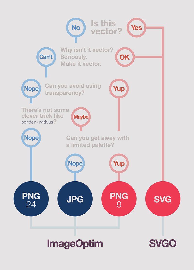
At Envy, our image optimization process is 3-fold:
- Picking the right format
- Picking the right size
- Optimizing via ImageOptim and SVGO
1: The Formats
Update: ImageOptim is really good at optimizing PNGs, especially if you enable lossy minification. PNG24 will more than likely be sufficient for most cases.
These are merely rule-of-thumbs, and any format will surprise you. Be aware of compression tendencies, but always experiment.
The most essential part of image optimization is understanding the basics of each file format. Ideally, your image weight should be split between:
- SVG for low-color images (and everything you possibly can)
- JPG for photos, paintings, or any other high-color imagery (including screenshots containing these)
- PNG for any images needing true transparency (or when PNG-8 is being stupid)
Just about any graphics software these days can export / change file type. Whatever you use, make sure you convert to sRGB color space. That’s important to make sure your colors show up the same on everybody else’s monitors.
What about GIF?
You know when you need GIF: animation. If possible, try to use MP4 (H.264) instead.
2: Image Resolution
Note: the word Retina™ is used to mean all “high-pixel-density” screens, regardless of manufacturer. I also use Kleenexes® and Band-aids®.
We save out retina (2×) and normal image assets for all of our non-vector assets. The actual size depends on the content; if we have full-bleed (edge-to-edge) images we’ll typically save 2 versions:
752wfor mobile devices (if it saves bandwidth over1280w)1280wfor desktop2560wfor retina tablets and large displays
If you use webpack, you can easily resize on-the-fly thanks to loaders like srcset-loader.
We’ll also make adjustments to resolution from there based on importance. Primary photos, since they’re main content, will have to be crisp and vivid, so we may make those higher-resolution than normal. But for background textures where pixelation is less noticeable, we can afford to crunch those images a little more.
In both instances, pixel density media queries such as
@media only screen and (min-resolution: 1.5dppx) {
  /* retina styles here */
}
work wonders for keeping your code performant across platforms without sacrificing your vibrant, high-resolution imagery. In our Sass-fueled environment at Envy, we’ll use functions such as:
=retina($width) @media only screen and (min-width: #{$width}) and (min-resolution: 1.5dppx)
  @content // Example
    .container
      background-image: url('bg.jpg') // 960w image +retina(960px)
      background-image: url('bg@2x.jpg') // 1920w image
to only load high-resolution images when the screen is a) a minimum width, and b) capable of even
showing retina imagery. If you didn’t have min-width as part of the query, for example, you’d be
bogging down all your iPhone 6/7/8/X visitors (a 750px display) with 1920px-wide imagery—a complete
waste of bandwidth and memory.
All-in-all, the main idea for effective image resolution is asking: Where am I wasting resolution and bandwidth on images that don’t need it?
JPG tip: resolution > quality
A neat trick, since we live in the era of browser scaling, is to actually save out JPGs at 2× resolution and at low quality. You can then use CSS to down-scale the images, and the final result is not only a fraction of its original size, but is now retina-enabled as well.
Note: you can reduce quality through ImageOptim in the next step, after you’ve adjusted the resolution.
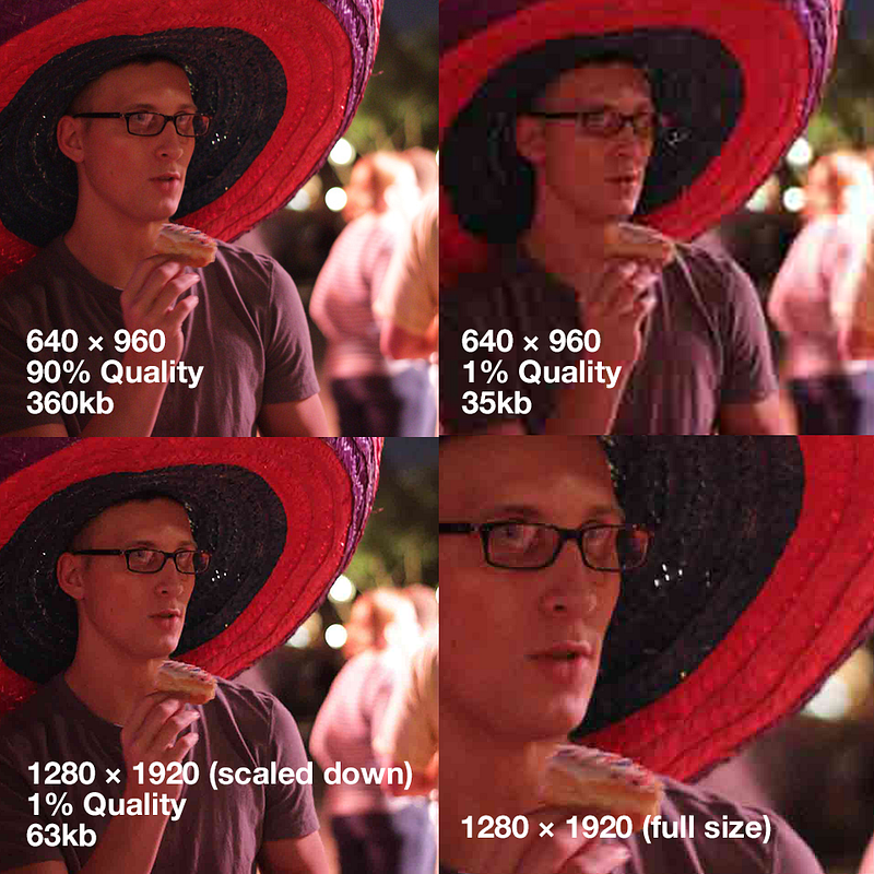
Experiment with different quality settings and resolutions on an image-by-image basis to find what works best for filesize vs image clarity. But the basic concept is resolution > quality — bigger resolution, low quality always wins over low resolution, high quality.
JPGs gonna JPG (translation: you’re dealing with a lossy format regardless; use it to your advantage rather than try to fight it).
Caveat: this trick doesn’t work as well for pages with heavy animations, or pages with large numbers of images — it can get very resource-intensive pretty quickly. Also be sure to test performance in all mobile browsers you’re targeting.
3: ImageOptim & SVGO
ImageOptim contains a small army of image optimization tools — PNGOUT, Zopfli, Pngcrush, AdvPNG, extended OptiPNG, JpegOptim, jpegrescan, jpegtran, and Gifsicle — while SVGO does one thing and one thing only: SVG-smashing. Both tools are absolutely indispensable in shaving cruft off of images with no time taken and at no quality reduction to you.
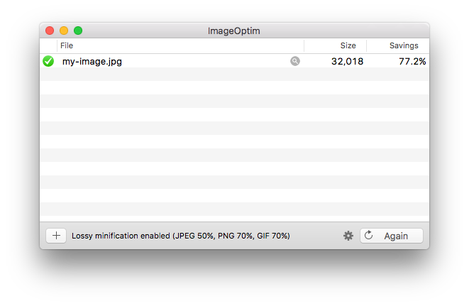
ImageOptim is cake: principally pop a portfolio of pictures into its porthole to perceive its profound prestidigitations (drag-and-drop a folder into the ImageOptim window — that’s it!).
You can either conservatively crunch your images with lossless compression (default), or you can enable lossy compression in the settings (what I recommend) for the absolute smallest images sizes you can handle. Further, ImageOptim is also fully-usable via command-line as well. For Windows users, sorry — you can’t get the nice little bundle, but you can get access to similar libraries that do essentially the same thing.
Note that if you use lossy compression, you do not have to export images at a lower quality from Photoshop, etc. Typically, I’ll save images out at 100% and let ImageOptim do the quality downsizing (make sure to make a copy first if you’re testing out quality without ruining your image).
SVGO (command-line only) does the same but for SVGs GUI version here). You may encounter some difficulties if your vector artwork is unusually complicated, but for the vast majority of artwork, SVGO is pure magic.
The Future
Google’s new WebP format has not only broken records in file savings and image quality but might possibly be the first web format in history to have a mainstream media source actually care. It boasts 26% savings over PNG and 25–34% savings over JPG. The catch? None! It’s going to be great. But currently, Google is the only one using Google’s image format (Safari, Firefox, and IE are quiet about supporting it anytime soon). The numbers don’t lie, and we may very well be heralding a new image king in the future.
Author note: Opera does, in fact, support WebP. But wasn’t mentioned due to the sad fact that although Opera supports many forward-thinking web standards, the internet as a whole doesn’t exactly support Opera.
Picture & srcset
The picture element and
srcset responsive helpers — not formats, per se — are close but
not ready for prime-time just yet. Ideally, these will modify how you use the <img> tag on sites,
but we’re still currently waiting for implementation in
Safari and IE. In the meantime, keep your eye on
browser adoption and we will, too.
P.S.: for those cheeky individuals who checked the page weight of this exact blog post and found a 1MB image
Firstly: good on you! Let me be the first to congratulate you in bringing the prometheal light of fast, performant internet to mortals.
But to quote Ricky Ricardo, lemme splain myself: I had to include a nearly-1MB PNG-24 in order to show every pixel of JPG compression accurately. If I used JPG instead, I would have JPG-compressed my JPG compression. Yo Dawg! (yes, JPG is lossy even at 100% quality).
Making heavy-weighted pages to talk about image page weight. How… meta. Have to crack a few eggs to make an omelette, I suppose.