Don’t use HSL
Making websites usually involves COLORS (they’re all the rage these days!).
You’ll no doubt find HSL easier to work with as a developer, since it was designed to manipulate colors more directly. However, just because it’s easy to edit doesn’t mean it’s a superior format. In fact, quite the opposite.
HSL is missing a lot more than it gives
Though HSL derives from sRGB, there’s not a 1:1 conversion of colors. In one sense this is obvious, because HSL’s appeal is that it’s not sRGB. But in another sense, just how different they are can often be overlooked, and you’d be forgiven for not realizing HSL is as bad as it is.
| format | formula | values | spread |
|---|---|---|---|
| sRGB | 256 ^ 3 | 16,777,216 | 100% |
| HSL | 360 ✕ 100 ✕ 100 | 3,600,000 | 22% |
Just comparing the possible values, HSL is missing almost 80% of sRGB’s. But if throwing away 80% of colors weren’t bad enough, it’s actually worse! Not every HSL value maps to a unique sRGB color, and there are multiple ways to express the same color in HSL. For example, when saturation is 0, HSL has 36,000 different values that generate only 100 grays. When you remove all the duplicates, HSL is missing closer to 85% of sRGB’s colors (source). And when is an 85% loss in quality ever acceptable?
When is an 85% loss in quality ever acceptable?
HSL can accept decimals, though! you may think. However, when you try to manage HSL values with a single decimal place, it skyrockets to 3.6 billion possible values and becomes a barren wasteland of mostly-duplicated colors. Since now most adjustments won’t end up changing the color at all, it means using HSL with decimals makes it worthless.
So back to our original premise: when storing colors, HSL is a terrible format to use because it’s missing so much of the sRGB color space. And attempting to fill in those gaps results in mostly-useless values.
The “L” stands for “Ludicrous”
If missing colors weren’t bad enough, the colors that are there are widly distorted. It’s assumed that the L in HSL designates the lightness of a color, right? Well, in theory, yes, but in practice…
Turns out lightness as expressed in HSL is really useless when translating from one hue to another. Compare all these values that have 50% lightness in HSL, when compared to their grayscale equivalents:
Calculated using better-color-tools
Not even close. Yellow is significantly brighter than the other colors! While L does have a purpose, it’s usually not what people think.
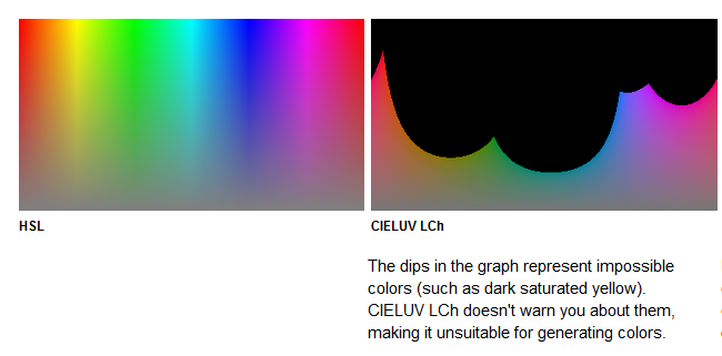
Use OKLCH instead
OKLCH is a perceptually-consistent color space that can be used today in all major browsers. It works exactly like HSL, except it actually works. The “LCH” part of it stands for Lightness, Chroma, and Hue. If you rearranged it to HCL, you’d realize it’s only off by one letter from HSL. Rather than Saturation, you’re dealing with Chroma which is the same basic concept, just modified to be a little more honest (some colors can achieve higher chroma than others because of the asymmetric gamut of RGB monitors, thus, it’s a linear scale rather than a percentage).
Picking OKLCH colors is simple using online an online tool like oklch.com or better-color-tools. Using it in CSS is possible through the oklch() function which has wide browser support as of 2023.
.button {
  --color: oklch(70% 0.16 240); /* 240° blue hue, 70% lightness, 0.6 chroma */

  background-color: var(--color);
  color: white;
}

/* on hover, lighten 10% via OKLAB’s algorithm */
.button:hover {
  background-color: color-mix(in oklab, var(--color), 10% white);
}
✨ Tip: always use
in oklabas the mixing space for color-mix(), even when using OKLCH colors. It will outperform any other blending mode almost every time (comparison).
So again, it’s not that the premise of manipulating color via hue, lightness, and chroma/saturation are flawed; it’s simply that HSL’s implementation of it is unusable if you care about color integrity even a little bit. But OKLCH fits the bill.
So please, for the love of everyone’s eyeballs, don’t use HSL.