How to handle responsive font sizes in css
Are you making typography on the web harder on yourself than it needs to be? Probably. What if I told you I could give you a typographic scale that is:
- Universal: works in CSS, Sass, and CSS-in-JS
- Simple: easy to set up, quick to learn
- Stylish: actually looks good (it follows typographic principles)
- Automatically-responsive: makes responsive text sizes easier than you‘re used to
- Adjustable you can actually tweak it to taste
Would you not use it? Well good news, friends, it does exist! And it’s called Responsive Type Scales. And I don’t know for the life of me why it’s not the norm. Maybe it needs a more buzzworthy name. Maybe it needs a landing page (🤔 actually it probably does).
This blog post will cover:
- Responsive Type Scales: the basics
- Responsive Type Scales: the theory
- tips / faqs
But is this for me?
You’ll ask. Yes. Yes, this is for you. If you type words and put them on
the internet, you should use this. You can check the “FAQ” section at the end to learn how it works
with special edge cases and such.
part 1: responsive type scales
getting started
Typographic scales are a Goldilocks solution to font sizes. We don’t want too many font sizes in our site, but we need just enough to have the design look good and have structural hierarchy. We need just the right amount.
If you’ve ever used “shirt size” names like font-s, font-m, and font-l (small, medium, and
large, respectively), you’ve likely run into the “too few” end of the spectrum (unless you resort to
dumb names like font-xxxxl). But the real problem with this approach is this isn’t responsive
(unless you resort to even dumber names like class="font-xxxl font-lg-xxxxl").
A responsive type scale solves all of the above: gives you just the right amount (it’s configurable, so you can set the right number you need), and handles responsive font sizes elegantly.
But before we get ahead of ourselves, you’re probably wondering “how does it look in action?” (or you just want to copy + paste something and then leave). Let’s dive into an example first to show it in practice, then we’ll step back to explain the principles and reasoning. After all, no matter how solid a concept is theoretically, will you use it if it has bad DX? Rest assured this is quick to learn, easy to use, and solves your font problems.
To get started, copy some CSS classes into your styles (don’t worry; we’ll explain how we generated these numbers later):
/* fonts.css */
/* (note: ignore the em values for now and only focus on the class names) */


.font-u18 { font-size: 11.390625em }
.font-u17 { font-size: 9.950627481136905em }
.font-u16 { font-size: 8.692673779389363em }
.font-u15 { font-size: 7.59375em }
.font-u14 { font-size: 6.63375165409127em }
.font-u13 { font-size: 5.795115852926242em }
.font-u12 { font-size: 5.0625em }
.font-u11 { font-size: 4.422501102727513em;}
.font-u10 { font-size: 3.8634105686174953em }
.font-u9  { font-size: 3.375em }
.font-u8  { font-size: 2.9483340684850083em }
.font-u7  { font-size: 2.575607045744997em }
.font-u6  { font-size: 2.25em }
.font-u5  { font-size: 1.9655560456566725em }
.font-u4  { font-size: 1.7170713638299977em }
.font-u3  { font-size: 1.5em }
.font-u2  { font-size: 1.3103706971044482em }
.font-u1  { font-size: 1.1447142425533319em }
.font-d1  { font-size: 0.8735804647362989em }
.font-d2  { font-size: 0.7631428283688879em }
.font-d3  { font-size: 0.6666666666666666em }
.font-d4  { font-size: 0.5823869764908659em }
.font-d5  { font-size: 0.5087618855792586em }
.font-d6  { font-size: 0.4444444444444444em }
.font-d7  { font-size: 0.3882579843272439em }
.font-d8  { font-size: 0.3391745903861724em }
.font-d9  { font-size: 0.2962962962962963em }
.font-d10 { font-size: 0.2588386562181626em }
.font-d11 { font-size: 0.22611639359078162em }
.font-d12 { font-size: 0.19753086419753085em }
.font-d13 { font-size: 0.17255910414544176em }
.font-d14 { font-size: 0.15074426239385438em }
.font-d15 { font-size: 0.13168724279835392em }
.font-d16 { font-size: 0.11503940276362785em }
.font-d17 { font-size: 0.10049617492923625em }
.font-d18 { font-size: 0.0877914951989026em }
Don’t want to use CSS classes? You could use CSS variables or JS values or even Sass variables—it is universal after all and you can translate this into whatever works best
Then just sprinkle the utilities in whenever you need it:
<h1 class="font-u6">I’m an h1 so I’m 6 steps up from the base size</h1>
<h2 class="font-u5">
  I’m an h2 so I’m slightly smaller than h1, but still 5 steps up from the base
  size
</h2>

<small class="font-d1">I’m 1 step down from the base size</small>
What if that h1 tag needs to be a little bigger? No problem; bump it up one to font-u7. Or
smaller: font-u5. They’re just numbers; you go up (font-u*) or down (font-d*) as you need to.
nesting
Since we’re dealing with ems, we can nest sizes. Say we had an <h1> tag we wanted to be big, but
inside that we have a subheading we want to be the same size as the base font. How would we
accomplish that? Easy:
<h1 class="font-u3">
  I’m 3 steps up from the base size
  <small class="font-d3">I’m the same size as the base (3 - 3)</small>
</h1>
By thinking in terms of moving “up” or “down” a scale, you’re starting to think in relationships, which is how type works. Typography is less about absolute sizes, and is more about how much bigger or smaller one size is to another (how one “relates” to another).
But if this nests, won’t this be a pain to keep track of when you’re several components deep? If
you’re working in components, it’s probably smart to reset the font size back to 1rem (root font
size) so sizes within a component are predictable:
.MyComponent {
  font-size: 1rem; /* reset font size back to base */
}
This may seem like an annoyance at first if you haven’t done this before, but this is actually great practice. This will be an important principle for responsive sizes going forward.
responsive sizes
Responsive font sizes can be a nightmare at scale. Fortunately, using this system, you only have
to set a component’s base sizes for each breakpoint. But to add this, let’s copy the the same CSS
values from above, but this time we’ll use CSS variables and swap out the ems for rems:
/* fonts.css (expanded from above) */

:root {
  --font-u18r: 11.390625rem; /* the “r” in “u18r” stands for “root” */
  --font-u17r: 9.950627481136905rem;
  --font-u16r: 8.692673779389363rem;
  --font-u15r: 7.59375rem;
  /* … (add the rest from above) */
}
Then in your component styles, you only need to change the base size for its breakpoints:
.MyComponent {
  font-size: var(--font-d1r); /* small screens: 1 step down */
}

@media (min-width: 600px) {
  .MyComponent {
    font-size: 1rem; /* medium screens: base size */
  }
}

@media (min-width: 1200px) {
  .MyComponent {
    font-size: var(--font-u1r); /* large screens: 1 step up */
  }
}

@media (min-width: 1800px) {
  .MyComponent {
    font-size: var(--font-u2r); /* extra large screens: 2 steps up */
  }
}
You don’t have to do anything else! Because we’re using ems, our components all scaled while
preserving their typographic relationships. However, for the base component size, we did use rems
instead of ems to blow away any nested styles we may have had to deal with otherwise
(following good principles of layout isolation).
further reading
Congratulations! You’ve just learned the whole system. 🎉 From here you may want to explore the following:
- responsive-typography contains all the code above but packaged in a convenient npm wrapper
- CodeSandbox example showing how responsive type scales can work in an app
But perhaps even after seeing how it works, you have some lingering “why” questions. Such as: how big is a “step” in pixels? or what if I don’t like the scale above? or is this really simpler than other typographic libraries? Read on to get a little more into why this approach can work for everyone.
part 2: why responsive type scales work
Note: this section is completely optional to read—you have everything you need to start using a responsive type scale already. Everything that follows is theory and extra information if you’d like to understand the concepts a bit deeper.
3 principles of a type scale

As we mentioned above, typographic scales solve the Goldilocks problem of font sizes: you need just enough to make the design feel complete, but not too many.
Typographic scales are so effective because they’ve had time to mature. At over 600 years old, they’re as ancient as the printing press itself (they don’t look a day over 500 though). You’ve encountered typographic scales every time you’ve used a word processor like Google Docs. While you’ll find some slight variation from program to program, most typographic scales are identical save for a few numbers. And they have three guiding principles that are important to keep in mind: they scale exponentially, are expressed in steps, and prioritize relative sizing over absolute.
principle 1: exponential scaling
The classic type scale you know from almost every word processor is:
6 7 8 9 10 11 12 14 16 18 21 24 30 36 48 60 72Let’s look at the scale increase between the numbers:
6   7   8   9   10   11   12   14   16   18   21   24   30   36   48   60   72
------------------------------------------------------------------------------
  1   1   1   1    1    1    2    2    2    3    3    6    6    12   12   12
Notice how the numbers increase exponentially moving up the scale (it’s not a mathematically-perfect exponential equation, but it still exponentially increases at regular intervals):
                   |
                +--+
                |
                |
                |
                |
                |
             +--+
             |
             |
          +--+
      +---+
------+
The reason for this is that bigger font sizes require bigger increases for contrast. You can
probably recognize the difference between 6px and 7px type because that’s a 16.6% increase in
size. But you can’t tell the difference between 71px and 72px (1%). So 6 -> 7 make sense as a
typographic relationship, but not 71 -> 72.
Any type scale we make has to scale exponentially, which means we can mathematically automate it! Yay!
principle 2: type scales are expressed in steps
Given type scales’ exponential nature, it would follow that we treat them like exponents. For
example, when we’re dealing with powers of 2, how do we express it? Not as 2, 4, 8, 16… but as
2² 2³ 2⁴ …. Let’s apply that thinking to the type scale: we’ll take the same scale, but number the
steps themselves. And we’ll give the step itself a number (step² step³ step⁴ …):
6   7   8   9   10   11   12   14   16   18   21   24   30   36   48   60   72
------------------------------------------------------------------------------
1   2   3   4    5    6    7    8    9   10   11   12   13   14   15   16   17
Thinking in numbered steps lets you remove all the complexity of conditional logic. You don’t have
to go “OK so I’m at 24px, which means the next step up is +6 but the next step down is -3.”
You simply think in terms of being at a certain step and going up or down.
In the end, your new scale is just a list of integers, which is much simpler to reason about (this is only the bottom row from above):
1 2 3 4 5 6 7 8 9 10 11 12 13 14 15 16 17Another way to think about this idea is to treat it the same way you would a music scale. You don’t
say “first I’ll play a 440 Hz note followed by 493.8833 Hz.” You simply say “I’ll play an A
note, followed by B.” “A” and “B” are just shorthand names for the tones produced that are easier to
reason about. In the same way, you don’t have to remember that 9 was 16px; you just know that
your font size is a 9 on the scale.
principle 3: relationships matter
Take a look at the following type samples:
What if I told you that the “paragraph” size from Column B was the same value as the “heading” in Column A? Inspect it if you don’t believe me! Our brains don’t perceive absolute value as much as we think we do. Take this famous optical illusion from Edward H. Adelson:
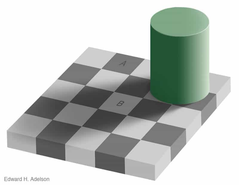
The tiles marked “A” and “B” are the exact same RGB value. Our brains perceive one as lighter than the other because of their relationships— “B” is surrounded by darker colors, and “A” by lighter colors. The illusion works because our brains are hardwired to perceive relative differences (if you’re interested in this general subject, see Interaction of Color by Josef Albers).
Managing a typographic system is the same in that the relative sizes are more important than
absolute sizes. Something isn’t a heading because “headings are 32px and that’s the law.”
Because as soon as your base size increases to 32px, headings have to be proportionately bigger to
match! No, headings are only headings if they’re noticably larger than normal text.
So how do we deal with relationships? We know that a type scale is expressed in steps already, but
now we have to think in relative steps from one size to another. Taking the scale we had before,
let’s slide the bottom numbers to center around our base font size—16px—to measure how far away
other numbers are, relatively:
6   7   8   9   10   11   12   14   16   18   21   24   30   36   48   60   72
------------------------------------------------------------------------------
-8 -7  -6  -5   -4   -3   -2   -1    0   +1   +2   +3   +4   +5   +6   +7   +8
We can easily see that 16 -> 18 is +1 step; 16 -> 30 is +4 steps; 16 -> 9 is -4 steps,
etc. If we move around the scale even more, we notice more interesting relationships. 16 -> 30 is
the same “ratio” as 30 -> 72. In both cases, there are 4 steps in between.
So now we start to get back to those font-u4 CSS classes introduced earlier. See how no matter
what our base size started with, all that matters is applying the correct number of steps up or
down? If we just know that we want a heading to be 4 steps above our base size, it gets a
<h1 class="font-u4"> class. And if we resize everything else on the page, that typographic
relationship is preserved. That means less code to write, and less code to manage.
It takes some work, and relearning, to remap how you’ve thought about font sizes on the web. But you’ll be amazed at how much simpler things become when you do.
building your own scale
Say you are getting the basics of the system, but that exact scale ratio just isn’t working for your fonts. This is the basic mathematical formula used, of which full credit goes to Spencer Mortensen:
𝐹 ^ (𝑛 / 𝛥)You have 2 basic settings to configure: 𝐹, the factor for multiplication, and 𝛥, the delta
(distance) between each step. Say you wanted to increase font size 2.25× every 6 steps (my
personal favorite scale). That would look like this:
2.25 ^ (𝑛 / 6)The last variable, 𝑛, receives the step number you’re calculating. This is how the example back at
the beginning of the blog post was generated—by counting up (1, 2, 3, …):
2.25 ^ (1/6)      ->    1.1447142426
2.25 ^ (2/6)      ->    1.3103706971
2.25 ^ (3/6)      ->    1.5
2.25 ^ (4/6)      ->    1.7170713638
2.25 ^ (5/6)      ->    1.9655560457
2.25 ^ (6/6)      ->    2.25
…
To go down the scale, use negative numbers (-1, -2, -3, …):
2.25 ^ (-1/6)     ->    0.8735804647
2.25 ^ (-2/6)     ->    0.7631428284
2.25 ^ (-3/6)     ->    0.6666666667
2.25 ^ (-4/6)     ->    0.5823869765
2.25 ^ (-5/6)     ->    0.5087618856
2.25 ^ (-6/6)     ->    0.4444444444
…
Tip: want to calculate these a bit more automatically? Try
this visual calculator or see the scale() method in JS
in
responsive-typography
Take the above values and plug them into CSS class names, CSS variables, Sass variables, JS
variables… whatever your system uses. It’s universal because at the end of the day it’s just ems.
Now that you know how these numbers are made, you may find that the 2.25:6 scale isn’t producing
the results you expected. Try playing with both numbers
and seeing what you get. Try it in an existing app! The key is experimentation.
That wraps up the main meat of the blog posts. What follows from here are tips and FAQs to try and take care of remaining questions.
appendix 1: faq
how does this compare to x, y, or z?
Ever since the idea of responsive design came about, we’ve been inventing complex systems to manage typography (or we’ve been ignoring it and hoping the problem goes away 🙈). There are too many to list out here, but prominent ones I’ve come across:
- Flexible Typography with CSS Locks:
this is probably the closest to a technically-accurate system, but just look at this
“human-generated” CSS for a single font size:
line-height: calc(1.3em + (1.5 - 1.3) * ((100vw - 21em)/(35 - 21))). Does your brain work like this? Mine doesn’t. - Tailwind CSS: here’s their simple example:
<p class="text-base sm:text-lg md:text-xl lg:text-2xl xl:text-3xl ...">. Imagine managing all that manually across all your markup? No thank you. - Typography.js: This requires a runtime? I’d rather not have flickering font sizes as my pages load, thank you.
- Material UI: Decent type scale, but not responsive.
In short, other proposals have come about, but they’re either too complicated for human-written CSS. Or they require a JS runtime for styling, which by default won’t work in a large number of setups. I’d argue that responsive type scales strikes the best balance of simplicity and efficiency, and it works in every setup.
how can I use this with multiple fonts?
When working with multiple fonts, sometimes one scale to “rule them all” will work just fine. But a common problem is having different fonts appear bigger or smaller than another at the same pixel size. In that case, you’ll need an adjustment number. Say your site has 2 fonts: one for body, and another for headings. Say your heading font is feeling a little small when you try and use the same scale for everything:
/* fonts.css */

:root {
  /* your base scale */
  --font-u6: 2.25em;
  --font-u5: 1.9655560456566725em;
  --font-u4: 1.7170713638299977em;
  --font-u3: 1.5em;
  --font-u2: 1.3103706971044482em;
  --font-u1: 1.1447142425533319em;

  /* heading scale */
  --heading-adjustment: 1.5px; /* Increase the final size of the heading font */
}

.font-heading-u6 { font-size: calc(var(--font-u6) + var(--heading-adjustment)) }
.font-heading-u5 { font-size: calc(var(--font-u5) + var(--heading-adjustment)) }
.font-heading-u4 { font-size: calc(var(--font-u4) + var(--heading-adjustment)) }
.font-heading-u3 { font-size: calc(var(--font-u3) + var(--heading-adjustment)) }
.font-heading-u2 { font-size: calc(var(--font-u2) + var(--heading-adjustment)) }
.font-heading-u1 { font-size: calc(var(--font-u1) + var(--heading-adjustment)) }
We have a --heading-adjustment CSS variable that we’re using to modify the final output value.
It’s being calculated at the end, so we are still using the same scale, but we can make a minor
visual tweak to make the typefaces work together better. Simply adjust --heading-adjustment to
taste. Rinse and repeat for any other typefaces you add to your project.
can i use this in CSS-in-JS?
Yes (try the JS import from responsive-typography).
appendix 2: tips
Some various tips you may find helpful both in adopting responsive type scales, and thinking about it in the context of your larger styling system.
- If you’re struggling, try working backwards from pixels. Say you’re trying to generate your
own type scale, but you just can’t find the right
factoranddeltathat feels right. Try starting with an absolute type scale like12px 14px 16px 18px 21px …, and work backwards into the relative type scale. Use the visual calculator and look on the right hand side. How close can you get to recreating your absolute scale? Now you have more of a concrete goal to hit than simply turning dials until something “feels right.” - Hardcode the scale if you can help it. It might be tempting to write a Sass or JS function to generate the scale values. While there’s nothing wrong with that, know that if you change your scale, you change your design. All the hard work and perfectly-tuned styles have now just gone out the window. I like to not have this “typographic restart button” so easily-accessible on a team that may not understand the implications.
- Rename the CSS classes to whatever you like. You may not like
font-u1orfont-d1. Generate your own scale and come up with your own names! Keep it short and sweet, but do what’s obvious to you. - Why not both—use CSS AND CSS-in-JS! It doesn’t hurt to use CSS utility classes AND CSS variables AND JS values in your CSS-in-JS. Sometimes you just want a global CSS class; other times you need a value in your scoped CSS Modules. There’s no right or wrong here; simply do what saves you and your team the most time, both in writing new code and managing existing code.
- Reset component styles at the base level. This is a good practice beyond this blog post! You always want your component’s styles to be isolated from one another, which means throwing some resets at the top level. When your components only look good in certain contexts but not others, you’re fighting a losing battle.
- Avoid global breakpoints if you can help it. Often people try and have a perfect breakpoint system in their app. It makes sense—it’s simple, and it’s encouraged in frameworks. But it’s bad because global breakpoints don’t care about your actual content. They don’t care that half of your components look weird as the page responds. Conversely, component-level media queries are always perfect for every component. It’s a little extra code, sure, but it’s 100% scalable, and unlike global breakpoints, adjusting one component’s breakpoint will never disrupt another. A little redundancy can save a lot of headache down the line. Give it a try and prove me wrong!
If this post was helpful, please give responsive-typography a star on GitHub (or give me feedback in the issues!)